While you may think visual merchandising or display is simply the art of arranging shapes in a pleasing or exciting way, there is far more to it than that. And if you really examine the subject, you will find that there are some presentations that are really different.
As a professional display artist, some years ago I made it my job to find out what was it—I'll call it, a textural quality—about some displays that made them work so much better. If you want to see examples of such composition you will find many in paintings from the Renaissance era.
 |
| The Annunciation |
Some good examples can be found in the paintings of Tintoretto (a nick name), who was considered one of the last great Venetian painters of the Renaissance. Also known as Jacobo Robusti and Il Furioso (due to the speed of his robust production), his real name Jacobo Comin. Tintoretto evolved ingenious techniques for the production of his paintings. One such technique was he created wax models of the figures used in his paintings. He arranged them and in doing so, he seems to have developed a technique for composition which—once you know what it is—you can see throughout his work. For example, you will see it in one of his famous works from 1518, titled The Annunciation.
In this painting, a flock of cherubs spills through a window above a door into a woman's house. But if you examine the cascade of cherubs, you will see the sort of textural quality I am speaking about. It appears as a dense texture, richness or almost a pageant of shape that flows together; rhythmic but never repeating; somehow unified, flowing together like a school of fish but without every element pointing in the same direction. One distinct characteristic of that textural quality wherever you see it, is the particles seem to belong together yet, each individual item stands out on its own. That is important in visual merchandizing because you are trying to get each piece noticed.
All this sounds pretty ethereal, no doubt. And you will either know what I'm talking about or not, but if not, it is only because you have probably never examined this kind of thing before and you don't yet have an eye for it yet. But you will.

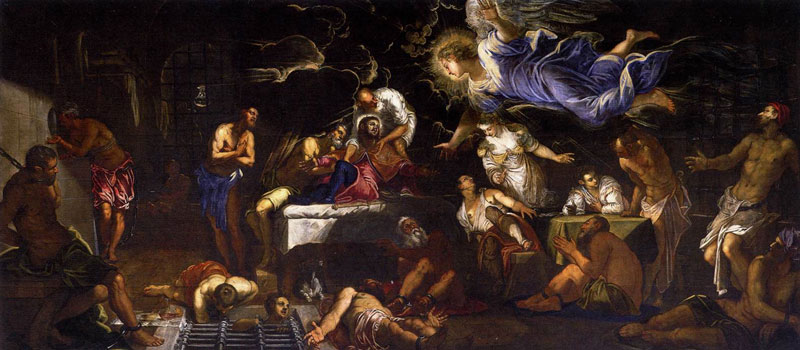
Here's another example: another painting by Tintoretto painted in 1548, entitled The Miracle of the Slave. Another crowd of bodies press together, above an unconscious slave, while St. Mark hurtles above to his rescue. If you look at the crowd, you'll notice the figures have that same textural quality, as the cherubs in The Annunciation. The art critics call it "drama" and it certainly is dramatic. They describe it as having "unexpected viewpoints and striking perspective." All no doubt true. But they don't actually know the mechanics at work here, mechanics by which you can produce this same textural quality, with utter predictably.
The author of Art through the Ages, was quite accurate when he points out about Tintoretto's work, "...the composition is made up of contrary and opposing motions; for any figure leaning in one direction, there is another to counter it. At the extreme left a group consisting of two men and a woman with child winds about a column. The main group curves deeply back into space..." and he goes on about the various elements of the painting.
But though he knows something is there and is even able to describe it in rough terms, he doesn't really know exactly what he's looking at. He can see it, but he doesn't understand what it is. I'm going to explain to you, in this essay, what it is. By learning this, your ability in the field of visual composition and display will be increased.
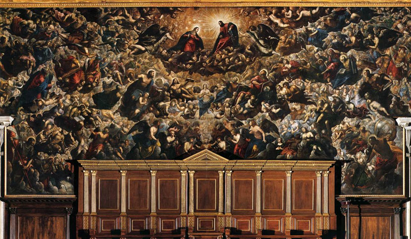 |
| Paradise, 1588 which also demonstrates his trademark texture of elements. At 74' x 30' this was the largest painting on canvas in history. |
Tintoretto himself apparently left no explanations. Perhaps he hadn't worked it out to the point of being able to explain it. This is highly possible. In fact, I was creating this same sort of geometric texture in my own work for several years before I knew what it was. I would just keep arranging things until it looked, "right." Finally, in my 9th year as a display artist, I decided to isolate what I was doing so it could be taught to others.
Since that time, as a measure of its workability, I used this knowhow to create thousands of displays and found that if applied this technique will not only produce a result, but improve your art. These are sculptural fundamentals.
But first, to ensure you have a grasp on this textural quality I spoke of, back to Tintoretto.
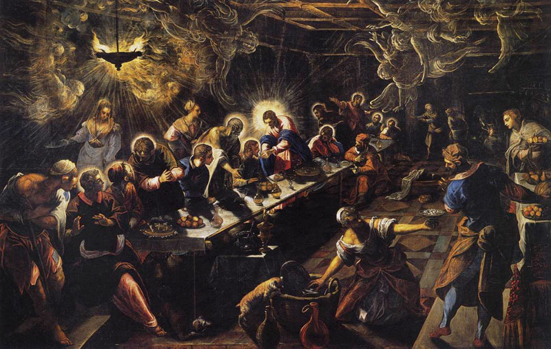 |
| The Last Supper, 1592 |
The Last Supper, painted in 1592 is another fine example. I'm using these paintings as examples, as you can see there examples of how you can position physical items together powerfully.
In The Last Supper, note how the figures create a rich texture of motion, each integrating with the next without becoming repetitive. The individual elements flow together in a fluid way.
 Another example is The Finding of the Body of St Mark, painted about 1562. Here in this work, especially in the three figures on the right foreground, you will notice a perfect example of this textural quality.
If you compare these paintings with many others from the day, you'll see how static many others are by comparison. And you'll notice that the figures of Tintoretto's are generally more dynamically powerful even through they aren't necessarily painted better.
The Basic Geometry
Any shape has a basic axis or center line, defined as "a straight line about which a body or geometric object rotates or may be conceived to rotate." (American Heritage Dictionary)
A human body has an axis that is the imaginary center line down through the center of the body (basically following the spinal column). Likewise, any object has such a basic center line. If you just look at various displays, you'll notice that geometrically speaking, some displays are more pleasing than others. They're very different.
The same can be said for composition of figures and shapes in paintings. Compare Tintoretto’s compositions with that of any other Renaissance painter. Correggio comes close, but his figures don't balance against one another. Titian's figures, as with most other painters, stand straight up and down. Or they have the same central axis. Paolo Veronese's paintings have a lot of motion, like Correggio's, but again the figures don't offset one another, and thus lack harmony.
The most pleasing straight-line geometry is the "V". Other formations—parallel axes (plural of axis) like "||" and "=" and perpendicular arrangements such as an "L" aren't nearly as powerful geometrically. As a maxim, the more V's you can work into a composition, the more appeal it has—the more people will be fascinated by it. And when you're talking about the arrangement of figures, you're talking about the V's of their basic center lines or axes. Look again at any of Tintoretto's works. Note how the figures "V" one against the other. But that's just the start.
Pictorial Invention
Any three-dimensional object has three basic axes: height, width and depth. Those are the "dimensions" as in "three dimensional" or "3-D" for short.
If you have two objects, you can arrange their center lines so they "V" on all three axes at the same time. ("V", meaning to arrange objects so that their center lines form a "V.")
Two rectangles of paper make this easy to demonstrate, if you hold them in your hands. If you imagine the three basic axes between these two pieces of paper, you can vee them on each of the basic axes in turn.
You can ROTATE them (each in opposite directions), which is to vee against the height axis. You can SPLIT them (each leaning out or leaning in), which is to vee against the depth axis. And you can TILT them (one backwards, one forward) which is to vee against the width axis.
But you can also vee them on any two axes at the same time. This gives three possible combinations (which is not particularly useful data, but I mention it in passing): rotated and split; rotated and tilted; split and tilted.
Now most display artists generally rotate and split each pair of items by default. Painters too, when they compose their subjects. And that generally is as good as it gets.
But, the big secret is that you can vee any two items on all three axes at the same time and that's when the composition really gains power. That's what Tintoretto was doing. Each pair of subjects was arranged so that they would counterpoint each other on all three axes at the same time.
 |
| The Ascent to Calvary |
About the clearest you can see an example of this is in the positioning of the upper and lower crucifixes in The Ascent to Calvary. Each one has been rotated, split and tilted in an opposite direction.
This is how to make your work stand out. It is what most people find the most pleasing, and what they like the best. My track on that is as a display artist, or more specifically, a 'trimmer" which is a particular type of display artist who suspends clothing in mid air using thin wires which when viewed from a distance, makes them look as if they have taken on a life of their own and are able to defy gravity and float in mid air. But there's no reason someone working with mannequins couldn't use the same techniques and make his work excell. This is what Tintoretto did and his paintings are in museums all over the world, even though his actual painting was not that great (in my opinion at least).
For a trimmer, the art is all in the geometric composition. A trimmer looks at an article of clothing the same way a painter looks at a daub of paint. It's just a shape. And his art is in the arrangement of shapes one to another.
The basic action is the precise positioning of each particle in space so it is juxtaposed with its neighbors in as many ways as possible.
Tintoretto seems to have had this down cold. And perhaps that is why a past curator of the Louvre (where some of Tintoretto's works hang) said, "Tintoretto is, with Michelangelo, the greatest painter of the Baroque; in his power of pictorial invention he perhaps surpasses any other artist in the history of painting."
That is a fabulous thing to say because it is really accurate. His words, "pictorial invention"—that is what I'm teaching you here. Look at the painting above. Now imagine if the apostles were simply sitting straight up and down at the table like people normally do. If he had painted that picture, honestly, we both know it would not be hanging in a museum today. I'm teaching you the key to pictorial invention.
As I mentioned above, Tintoretto made scale models of the scenes he painted before he painted them using figures of wax and clay. Then he would arrange and rearrange them until he got it right. Then, in a darkened room he would hold a candle in various positions to study the interplay of light and shadow across the forms. You can read more about how he painted in the Encyclopedia Britannica.
So here was a painter who developed his compositional skills exactly as a display artist would have done, using a techniqe that no one else was using. These models of his were essentially small "displays." He seems to have treated the figures as essentially just shapes. And he worked as many V's into his compositions as possible, V'ing many pairs of figures in all three dimensions at once. In Tintoretto's The Finding of the Body of St Mark look again at the figures on the far right foreground. Specifically, the woman leaning to the right foreground, and the man who is trying to hold up the fellow who has just passed out. These two figures, the man and woman, V against each other in all three ways: they are rotated, split and tilted.
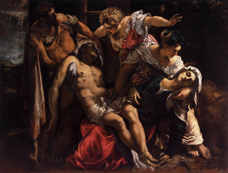 |
| Lament Over the Dead Christ, circa 1560. Note the double helix formed by the two principle figures in this composition. |
Spirals
There is one further way geometrically to set two items apart. And that is to twist one of them into a spiral or both into opposite spirals.
 Tintoretto's work shows many examples of this pattern. The Last Supper shows a great example of this, in the maid washing dishes on the floor and the figure stepping by just to the right. The upper half of her body and the lower half of his body are juxtaposed on all three dimensions. But then the upper half of the man's body spirals counter-clockwise. In fact, both characters are set into opposite spirals like the double helix of DNA. This technique can be seen again and again throughout Tintoretto's work including in the beautiful Lament Over the Dead Christ (above) executed with spectacular skill.
Spirals can make a dramatic and powerful geometric effect. But if you use the mechanism, you generally do have to use the double helix arrangement as otherwise the part twisted ends up paralleling the other object, and this looses some of your V's (to reinterate, the more V's you an work into your composition, the better and more powerful it will be).
Most of the figures in this particular painting do spiral. And within some, there is even a further effect: two opposite spirals within one figure!
In the painting below, on the far left, at the end of the table is Judas. His body makes a clockwise spiral (flowing up from his legs). Yet his head (with his left arm) makes a counterclockwise spiral, making him a figure of conflicting directions! Very appropriate.
Counterpointing
This principle of the V goes further. At its most fundamental, a V is the geometric manifestation of a "counterpoint" or "contrast." And obviously there are additional ways to counterpoint elements of a composition in addition to geometric. Such methods include light, texture, color, gender, transparency, finish, temperature, motion, surface patterns (such as stripes vs. solids), substance (wood vs. stone, steel vs. plastic, carpet vs. concrete), culture, age and more. And our maxim is, generally speaking the more V's you can work into your artistic creation, the better. So besides doing the geometric arrangement we've been discussing, you could also add in the juxtaposition of any or all of these aspects.

In The Last Supper and The Annunciation you will see the interplay of earthly beings counter-pointed with heavenly beings. Without this, the paintings would still be good, but they wouldn't be as interesting. And that is my main point.
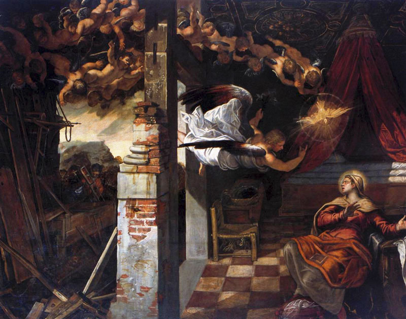
 |
| St Roch in Prison Visited by an Angel. Note the counterpoint of two distinct locations overlaid upon each other, the location of heaven overlaying the earthly location of the prison. |
The object is to make your compositions as interesting as possible. In Tintoretto's day, the interplay of light and dark had a name: chiaroscuro. Check out The Finding of the Body of St Mark and you can see this very plainly. It adds a lot, actually it was one of his trademarks present in all his works. So he also used light and shadow to add yet another layer of counterpoint.

In a painting entitled Christ before Pilate, painted in 1566 to 1567, you will find motion contrasted with no-motion. Christ stands perfectly still, while everyone else is in motion. As well, there is interplay of gazes. Christ looks fixedly at the basin of water where Pilate is washing his hands, sealing Christ's fate. Everyone else is looking elsewhere, and if you follow their gazes, you will see they go into a circle, or crisscross each other geometrically, following roughly our earlier rule about working V's into the composition. It was a subtle way to do it.
How to use these tools
Developing a composition is an objective activity. It doesn't require a lot of thinking. It mainly requires looking. Looking at your subject, looking at the space where you will put the display.
As you began to actually place the elements into position, you can keep in mind the rule about making their axes counterpoint along all three axes simultaneously. Much of this kind of thing gets worked out as you go along placing each item into the display. It's not the type of thing that slows or stops your action before you get going. It's the type of viewpoint that helps you decide instinctively what to do, that guides your decisions and speeds them up, while improving the art.
Application
The world is not always a very beautiful place. It needs the artist who's role is to inject aesthetics into the environment to counterpoint and balance those things we find unpleasant. Done in sufficient volume, the the artist can change the entire world just through art as the leaders of the Renaissance movement demonstrated in their day.
Remember that next time you get depressed from listening to the news.
Instead of dropping bombs on people why can't our national leaders assemble an army of artists to saturate problem areas with art to defuse conflict?
The only thing a bomb does is make things uglier. Beauty is a far more powerful tool.